ARC of Research pt. 2: Exploring Data Sources Relevant to Our Questions
In this second “analysis recommendations in context” post, we will explore the refined research questions from the first post, resulting from our discussion of how to design specific questions with understanding of available data source(s) and the context of what each contains. We emphasized the importance of selecting a data source that matches the goal of the research question. This is critical for analyses of broadband measurement data, particularly when the research goal is to compare the results to one another, to national broadband standards or specific funding requirements, or to align with advertised terms of ISP service.
In this post, we’ll explore the following research questions and walk through example analyses using Ookla and NDT public, crowdsourced data.
- How did aggregate download speeds and latency per ISP in each zip code in my state compare with the national broadband standard in 2020?
- How did the TCP protocol perform per ISP in each zip code in my state when testing beyond ISP last mile networks in 2020?
An accompanying Colab notebook is provided to allow you to run the examples provided here. All complete SQL queries will be linked as examples in the post below, so feel free to open the Colab notebook now to follow along. As you read through the examples, code and generated graphs, be thinking of these research questions or your own, and please keep these additional questions in mind:
- Have we selected/filtered the data enough to answer the question with confidence?
- Have we missed or overlooked anything?
- If we do miss something or if we can’t resolve an outstanding question about the data or the analysis, how will we explain it?
When considering any research question, it’s critical to understand the dataset(s) we’re dealing with, what’s included and not included, as well as the measurement methodology and data collection methods used. This is where our knowledge of what is included in the data, how it’s collected, and what it represents helps us understand where to dig deeper in our analysis. We may be able to address some questions or issues by additional filtering or other techniques, but some may not be able to be resolved. Either way we should know the data well and be ready to explain outstanding questions.
For reference, here is a quick review of what the NDT dataset contains:
- Measurements from all providers in a region, regardless of the service or speed tier
- Measurements taken at all hours of the day and night
- Measurements from mobile phones, fixed wireless, satellite, fiber, cable, DSL etc.
- Measurements conducted using all types and versions of the NDT test
- Measurements from all types and versions of computers, browsers, operating systems, etc.
Going back to our original recommendations post, here are a few things we should consider when selecting data for our analyses:
| Recommendation | Rationale |
|---|---|
| Always provide some sort of display by ASN to show metrics for each ISP in the geographic region of interest. Only strip ASNs as an optional part of the final step in your analysis. | ISP’s service offerings are different - DSL is not the same as cable, fiber is not the same as satellite, mobile carriers are different than all others, etc. Aggregating over all ISPs obscures the aggregate performance of providers that are doing well and those that aren’t. |
| Use a limited time frame. | A lot about a network can change over time. Aggregating over a whole year would hide when measurements got better or worse during the year. |
| Consider separate aggregations for peak and off-peak times. | The Internet is used more during peak times of the day, so measurements during those times are likely to be slower as a result. |
| Consider aggregation at a level of geographic precision appropriate for the underlying data, such as regions or cities for NDT data. | The infrastructure of the Internet, ISP’s network infrastructure, and the availability of different service tiers varies depending on location. Aggregating data over a large geographic area such as an entire country ignores these nuances. |
| Use other metrics besides median and average. | ISP’s terms of service often provide a download and upload speed. These are the maximum possible speeds, not the median or average over time. |
This of course isn’t an exhaustive list of things to consider for your analyses, but is a good starting point. We’ll next walk through how to filter queries to enact these suggestions.
Case Study: How does Internet service vary depending on where I live?
Many people look to M-Lab’s NDT data to try to answer questions about the state of Internet service where they live, within specific countries, or to compare their locales to others nearby. Let’s take a look at the two research questions we refined above to get some more context:
- How did aggregate download speeds and latency per ISP in each zip code in my state compare with the national broadband standard in 2020?
- How did the TCP protocol perform per ISP in each zip code in my state when testing beyond ISP last mile networks in 2020?
For the first question, we’ll explore Ookla’s public data, since our analysis needs to use measurements consistent with the maximum advertised speeds of providers. For the second question we’ll explore M-Lab’s NDT data, to assess the performance of connections as measured by NDT’s single TCP stream test to M-Lab servers hosted outside of ISP networks. We’ll look at question 2 first, since NDT data is already available in BigQuery, and later we’ll look at answering question 1 with Ookla’s public data.
TCP Performance Over Interdomain Paths per-zip code in Maryland, per-ISP, per-Quarter in 2020 (NDT / M-Lab Measurements)
We’ve restated question 2 slightly in the title of this section to introduce a new term: interdomain paths. This term is used by network scientists to describe an Internet path where data travels between two networks. It’s also another way of saying that the server used for measurement is not within the “last mile” network of the subscriber, but connected to a different network. The Internet is made up of distinct networks that connect with each other to exchange data. My ISP connects my house to their network, and their network connects to other ISPs, and so on. The common exchange of data between networks is critical to our experience of accessing content and services online that can be hosted anywhere. We’re also explicitly naming that this is an analysis of TCP’s performance over interdomain paths per-ISP, which is very different from the analysis we’ll do using Ookla open data to explore speeds and latency compared to the US national broadband standard.
To start our exploration, let’s turn to our Colab notebook in Example 1. The query in Example 1.1 returns the median and average download measurements in the state of Maryland in 2020, grouped by quarter, zip code, and Autonomous System Number & Name (ASN). ASN is how M-Lab identifies the provider or ISP in each test result. We also include a count of samples and unique IP addresses in the grouped results, and limit to only those results where the sample count was 100 tests or above from at least 25 unique IP addresses within each ASN.
Before we even look at the metrics returned by Example 1.1, we can see a reason why splitting out our results by ASN or provider is critical to our analysis. Take a quick look at the unique list of AS Names in the results of Example 1. We can clearly see a list of all types of organizations, companies, etc., some of which are recognizable names of ISPs, and many that are not. Since our research question is intended to examine home broadband connections, we refine the query in Example 1.2, and limit our results to AS Names that represent recognizable, fixed home Internet service providers. The final query and graph selects the top 10 Maryland postal codes by NDT median download performance from Comcast users in Q3 2020.
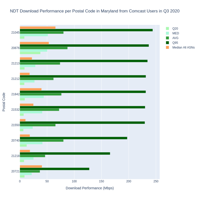
This tells us something about the range of NDT measurements achieved by Comcast users in Maryland. The graph above orders postal codes by the 95th percentile of NDT measurements. Percentiles may be new metrics for some users, but essentially represent the low and high end of the spectrum. Average and median are perhaps more recognizable, and we include both to illustrate the differences between them. Note that we also have included the median download for each postal code across all ASNs, to show the impact of not filtering per ISP in a postal code. In short, a metric over all providers misrepresents the measurements of individual providers.
Example 1.2 implements most of the recommendations we made above:
- aggregate by ASN or provider
- use a limited time frame
- aggregate using an appropriate geographic area
- and metrics besides median and average
In this case we’re examining NDT download measurements by quarter in 2020, for each ASN within each postal code in Maryland, United States. Yet we could still improve our analysis in Example 1.2 by looking at measurements conducted during peak and non-peak times separately. Recall also that NDT is measuring how TCP performed when measuring beyond ISP last mile networks. The NDT measurement includes how well connected last mile providers are with other networks that link their customers to the Internet. We could also look at segmenting our analysis to show the differences in their connectivity to these other networks. We’ll explore these ideas in future posts.
For now, let’s move on to an examination and comparison of Ookla’s public data.
Aggregate Download Speeds and Latency per Postal Code in Maryland in 2020, Compared with the National Broadband Standard
As we’ve discussed above and in the previous post in this series, measurements from Ookla’s speedtest.net platform align with the service that ISP’s typically offer, and to the FCC’s National Broadband Standard, although still with some ambiguity. We discuss the similarities and differences in our post from July 2021 about the data sources presented in NTIA’s Indicators of Broadband Need map, as well as our follow up, Revisiting National Broadband Datasets and Maps.
Ookla provides a commercial service called Speedtest Intelligence, providing a wide array of analytics derived from the speed tests submitted by people to their platform. Recently Ookla also began offering open data through their Ookla for Good program. Speedtest data is provided globally for fixed broadband and mobile networks separately, aggregated in tiles that are approximately 610.8 meters square. Ookla releases these tiles as GIS shapefiles and in another format called Apache Parquet, for each quarter. The available metrics for each tile are average download and average upload speed in kilobits per second (kbps), average latency in milliseconds, the number of tests, the number of unique devices that submitted the tests, and a key field that serves as a unique identifier for the tile. Ookla for Good data does not include a breakdown per ISP, but we could assume that more detailed data is available for purchase through Speedtest Intelligence.
Several tutorials are available to learn to work with the Ookla for Good data. We used these tutorials to prepare this post, specifically to follow Ookla’s guidance for computing weighted means or averages when aggregating tests covering multiple tiles. Since tiles are independent of the geopolitical areas that many people are interested in (for example US states and counties, or countries and regions within them), our analysis of Ookla’s tile based aggregated data requires us to examine data using methods of intersecting geographies. To accomplish this we loaded the Ookla for Good shapefiles into BigQuery tables so we could use BigQuery’s support for geospatial data.
Let’s look at Example 2 in our Colab notebook. Reviewing the query, you can see the use of intersecting geometries to get aggregate results by postal code. We load the geometries of US postal codes first, then select Ookla tiles that intersect with postal codes in Maryland, and finally select our statistics in the final step. Using the documentation in Ookla’s tutorials, our query returns the weighted average for upload and download speeds, the weighted average latency, the number of unique devices, number of tests, and the number of tiles included in each postal code. We also have converted download and upload speeds to megabits per second (Mbps). The query returns the top 10 postal codes by weighted average download speed, seen in the bar chart below.
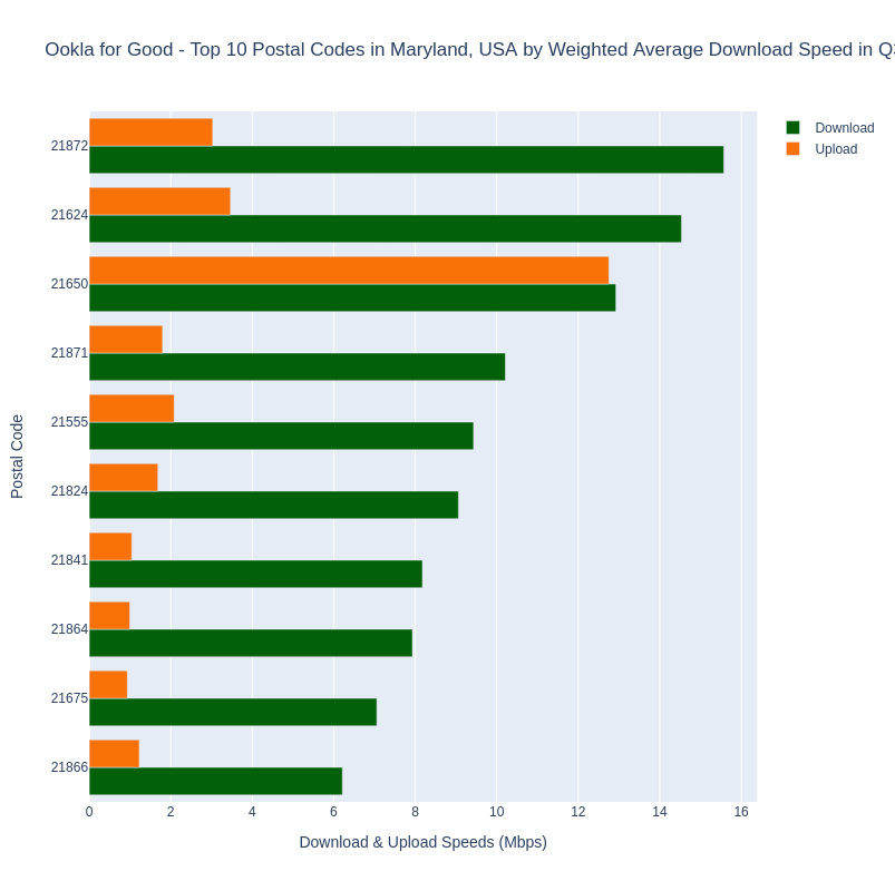
At this point we can observe a couple of things about the Ookla for Good data. First, we can only use it to see weighted averages for the available metrics per geography. To get a breakdown by ISP within a geography we would need to purchase access to Ookla’s Speedtest Intelligence product. This is similar to the public access to Ookla data provided in the NTIA’s Indicators of Broadband Need map, but there NTIA is providing the median values per geography. While we would recommend drilling down to see the data per provider within any geography, the Ookla for Good datasets are segmented by fixed broadband and mobile networks, which is better than including both types of providers in the same dataset. We also observe that only one metric is provided, weighted average. While weighting the metric using the number of tests in the sample is very good, we really can’t compare this number to the FCC’s National Broadband Standard. 25 Mbps download and 3 Mbps upload refers to the maximum possible speeds an Internet connection can achieve, where the weighted average only tells us the speeds anyone in the postal code achieves on average. Again, we also can’t include ISP in the aggregation without a Speedtest Intelligence subscription.
To illustrate the issues discussed above, let’s look at a graph comparing them side by side instead of on a map one layer at a time. In Example 2.2 we’ve combined our previous query for NDT data by postal code (without ASN/ISP) with our query for Ookla for Good data. We’ve adjusted the NDT query to return weighted averages for download and upload speeds so the metrics are the same, and limited the results to show only postal codes where there were at least 100 tests from at least 25 distinct devices (Ookla) or IP addresses (NDT). The top 10 postal codes ranked by the Ookla download speed weighted average are graphed in the chart below. You can see the actual values when interacting with the graph in our Colab notebook.
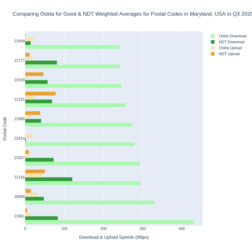
Again, it’s important to note that the comparison above isn’t what we recommend, but is presented here for comparison. On the surface, these data show 10 postal codes in Maryland where the weighted average measured speeds for both Ookla and NDT meet or exceed the 25/3 broadband standard. But as we mentioned, this is for tests submitted from people subscribing to any ISP that was located in each postal code. To unpack this a little more, let’s explore the breakdown by ISP within one of these postal codes, 21837. What ISPs make up the results in 21837? See Example 2.3.
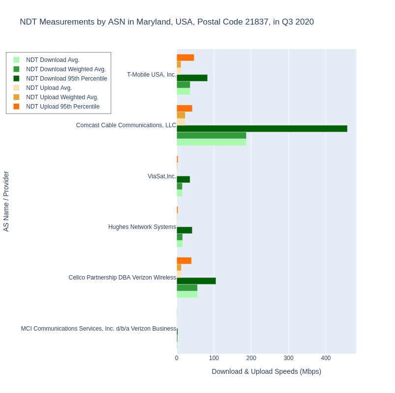
Comparing the graph for Example 2.3 showing the breakdown of ASNs in postal code 21837 with the previous graph in Example 2.2 for all providers, we can easily observe why examining speeds per provider is important. The weighted average over all providers in 21837 for Ookla tests was 293.252 Mbps download and 11.653 Mbps upload. For NDT measurements in 21837, the weighted averages were 72.946 / 9.725. Breaking down by provider however, shows how grouping all providers together paints a more accurate picture. It’s clear that tests from Comcast users are bringing the overall numbers up for the whole postal code, but tests from users subscribed to other providers are bringing the overall postal code numbers down. Again, we’re using NDT data here to demonstrate the issue of aggregation without considering ISP within a postal code. We expect that the same pattern would be observable in Ookla’s data if it included ISP.
We can also observe that with NDT data, aggregating at any geographic level without a breakdown by ASN groups different types of ISPs together. In Example 2.3, we see two mobile providers, two satellite providers, one cable, and one business ISP.
Conclusion & Next Steps
In this post, we explored NDT and Ookla for Good datasets to ascertain whether they can help answer the following research questions:
- How did aggregate download speeds and latency per ISP in each zip code in my state compare with the national broadband standard in 2020?
- How did the TCP protocol perform per ISP in each zip code in my state when testing beyond ISP last mile networks in 2020?
We suggested that Ookla measurement data would be the best source for answering question #1, since the question asks for download speeds compared with the national broadband standard. Ookla’s publicly released aggregate data doesn’t contain breakdown by ISP, but their Speedtest Intelligence product does. On the other hand, NDT is best suited to answer question #2, because the interest is how the TCP protocol performed to points outside ISP last mile networks.
With a deeper understanding of the different broadband datasets and the context of what they measure related to the US broadban standard, we revisited our research recommendations and provided a rationale for each. Our examples in this post implemented most of those recommendations, and demonstrated why aggregating by ISP or ASN within any geographic area is critical to get precise analyses. In the final example we observed that all types of ISPs are included in the NDT dataset, and that should be a prompt to us to split out analyses for providers using different access media wherever possible.
We also asked you to keep a few questions in mind that should always guide our analyses:
- Have we selected/filtered the data enough to answer the question with confidence?
- Have we missed or overlooked anything?
- If we do miss something or if we can’t resolve an outstanding question about the data or the analysis, how will we explain it?
In our next post, we’ll cover the last of our basic recommendations: how to separate aggregations for peak and off-peak times, and begin to explore additional analysis methods that can make our research more robust, particularly when selecting data collected via crowdsourcing.